Duration:
January 2018 – May 2018
(Semester-long project)
Objective:
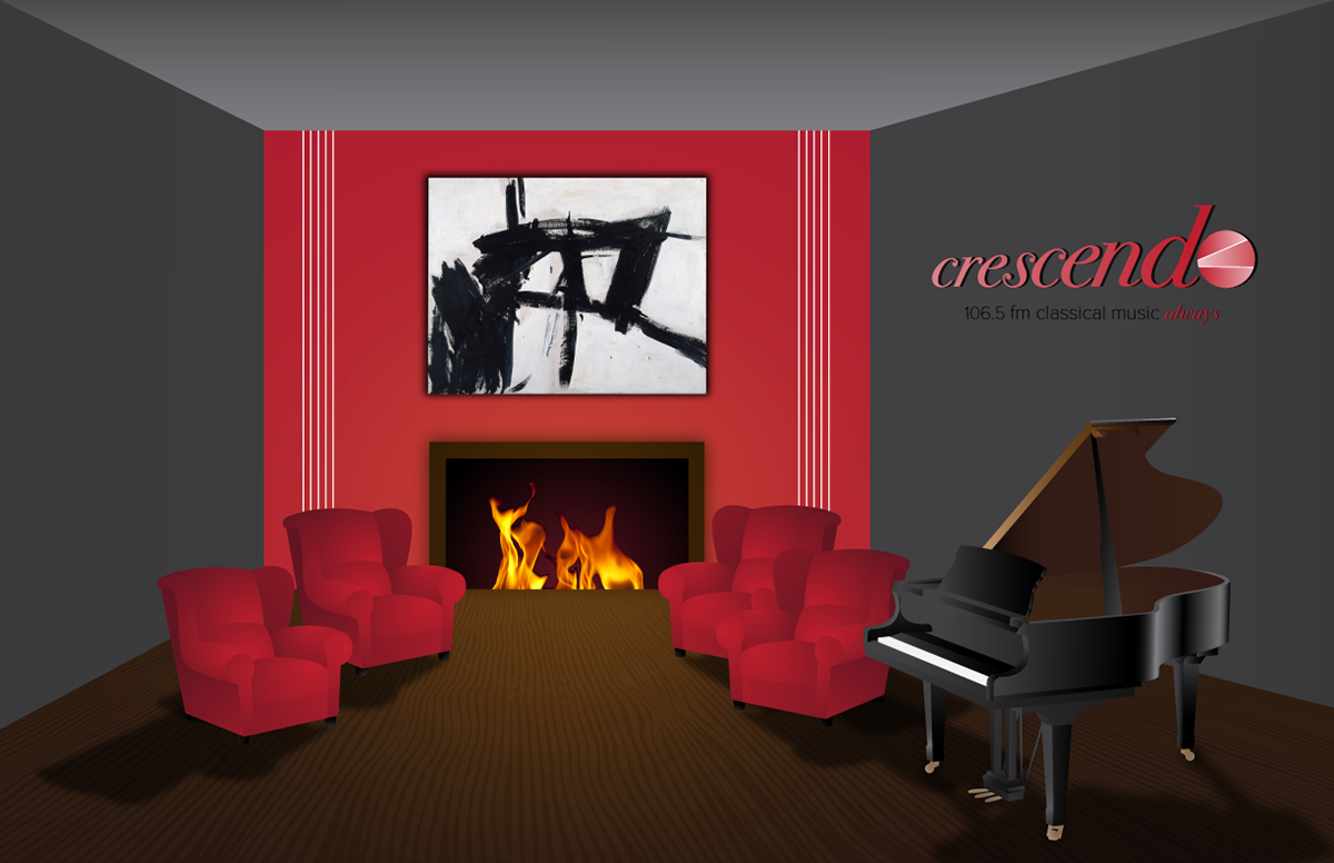
On the first day of Identity/Branding class, each student randomly picked a paper out of a hat, containing a business name and type. The business I picked was a classical radio music station, Crescendo 106.5, located in New York City. It was my job to design the rest of the identity for Crescendo in the form of many different design projects throughout the semester.
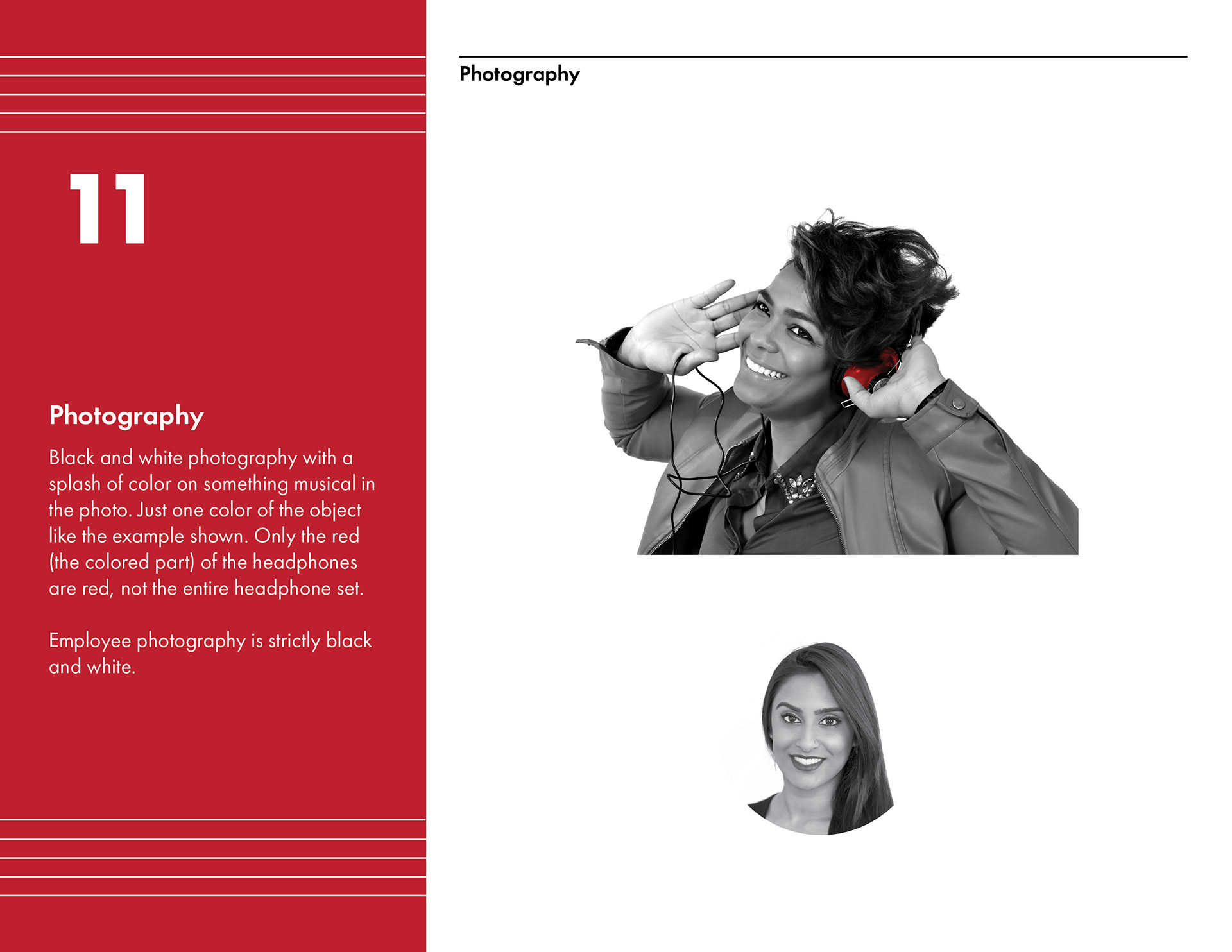
The different assets needed to be designed were as follows; logo, identity manual, website, brochure, business card, email signature, and environmental design.
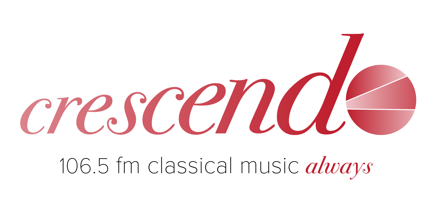
Logo Design:
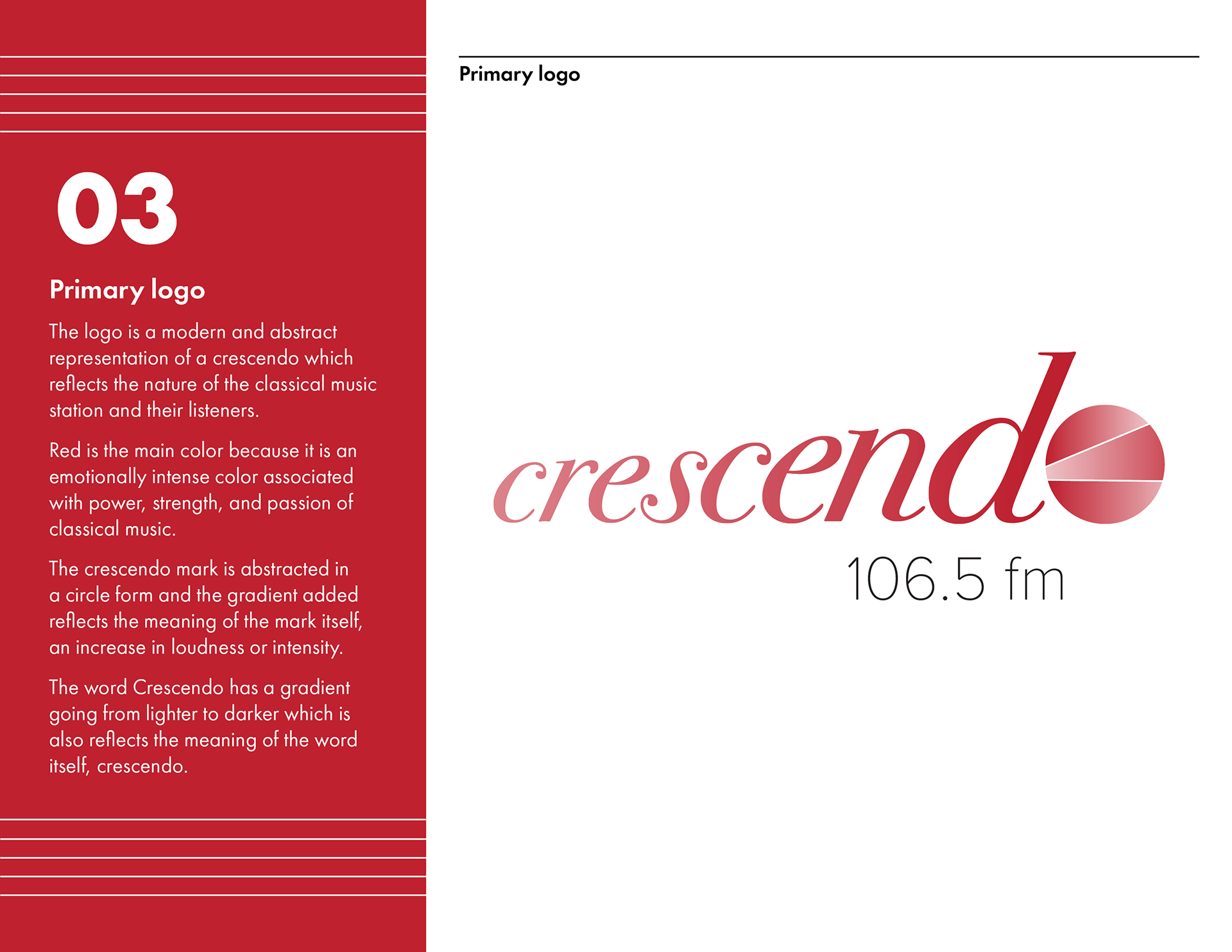
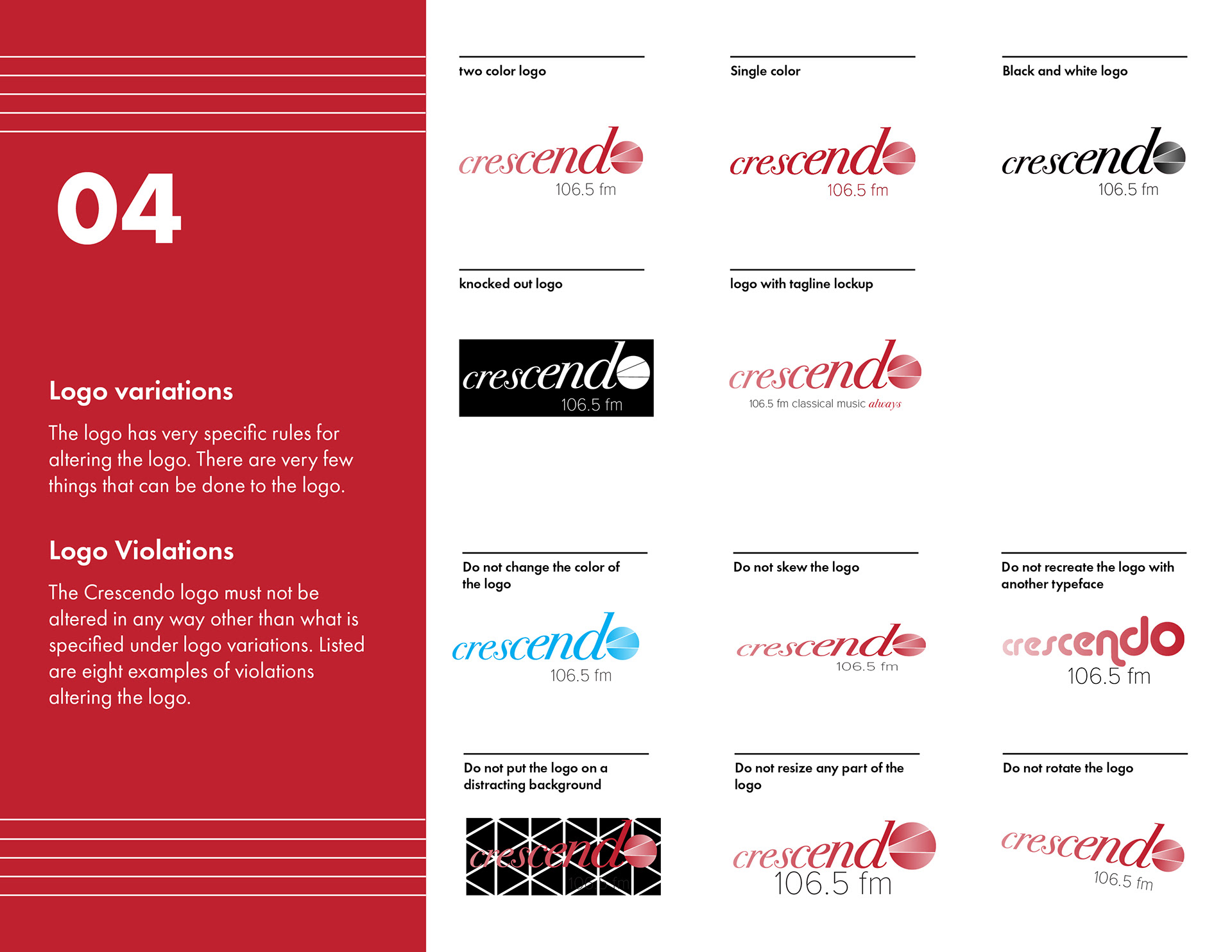
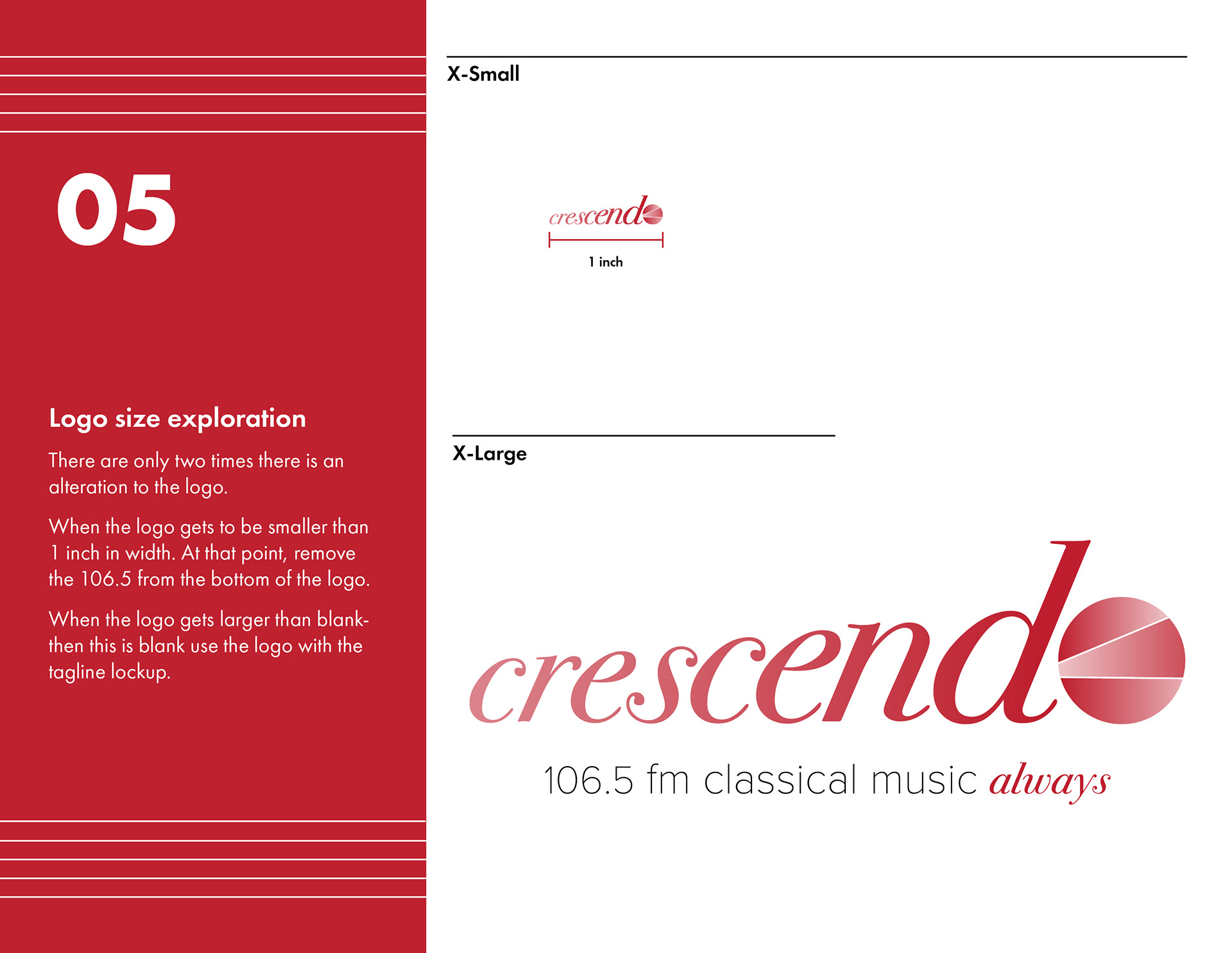
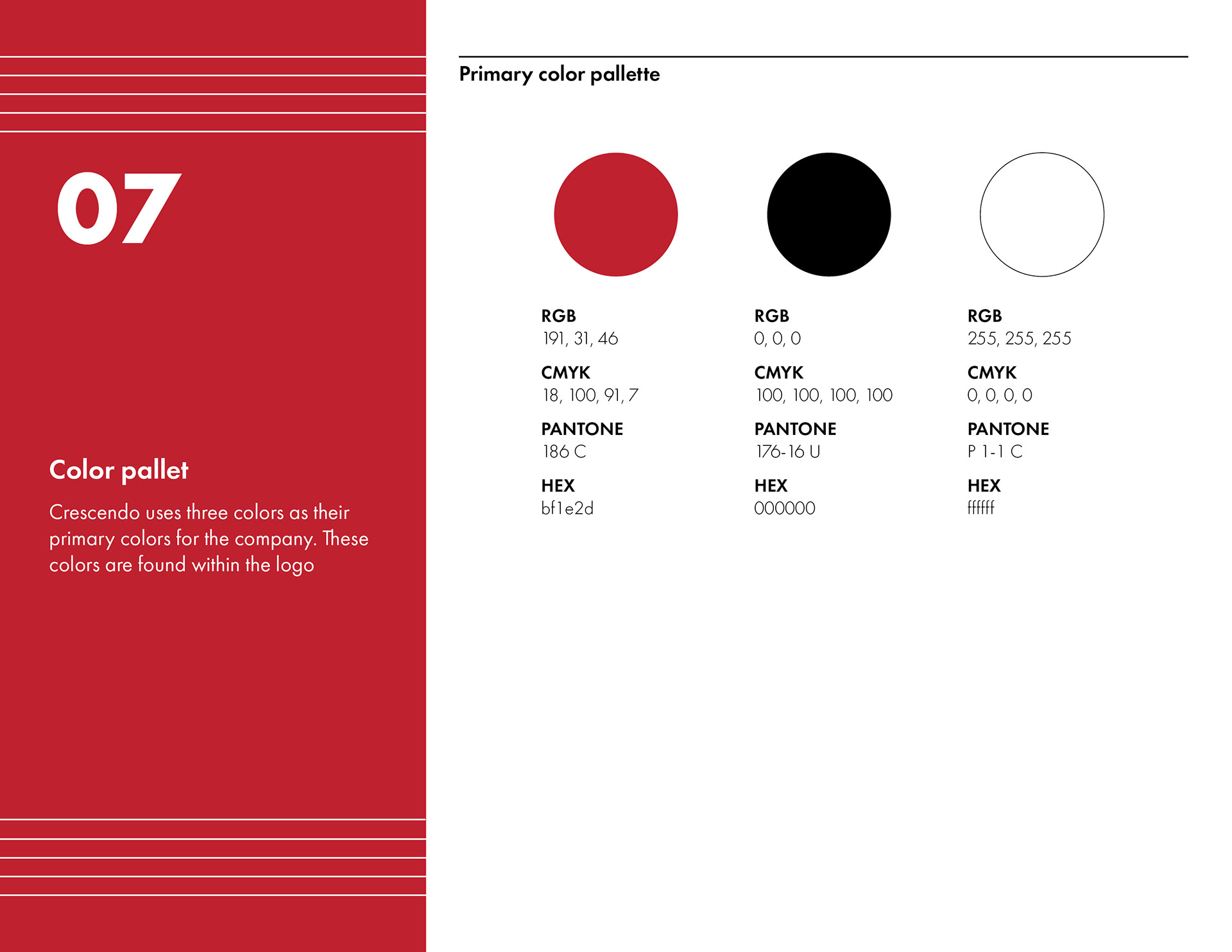
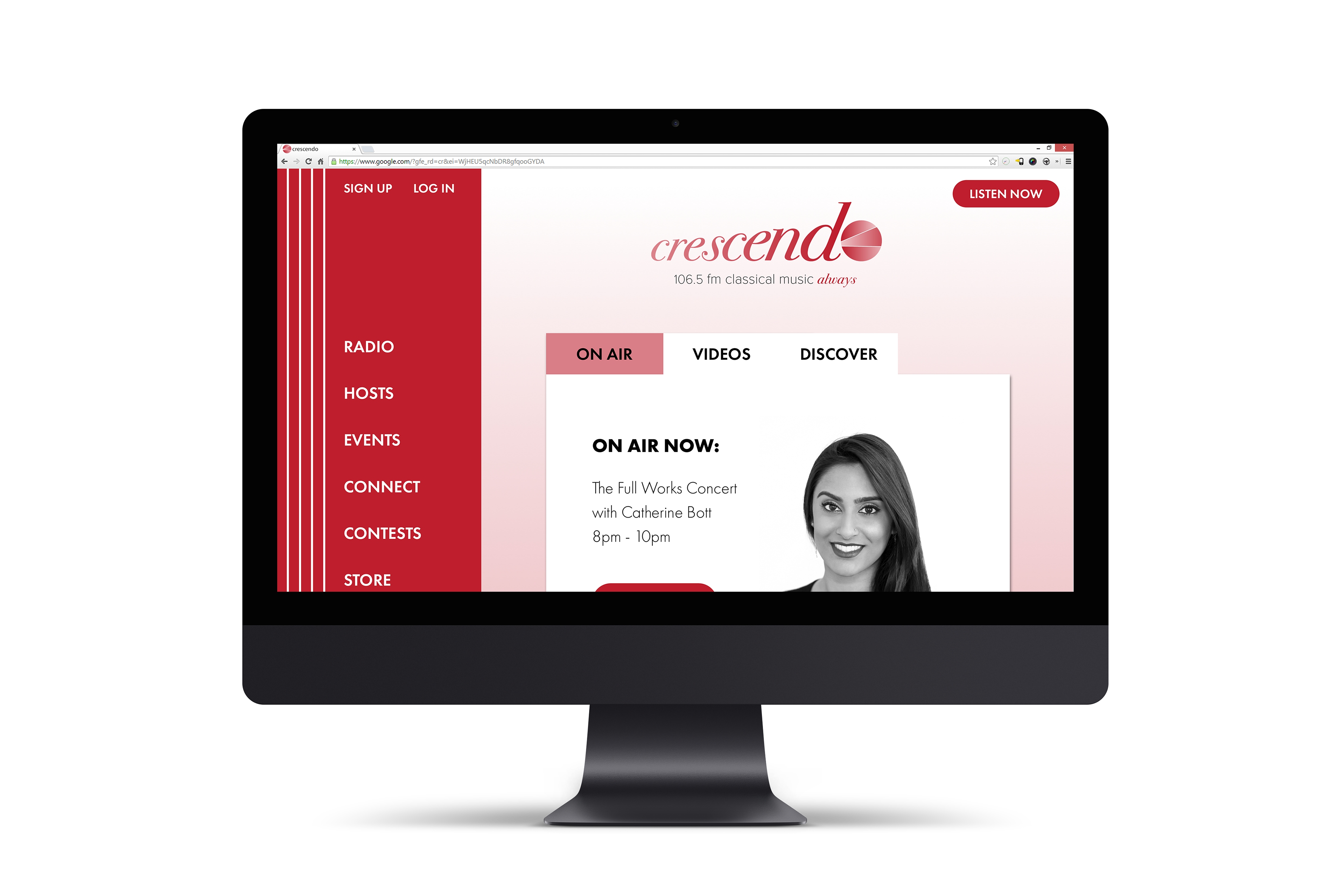
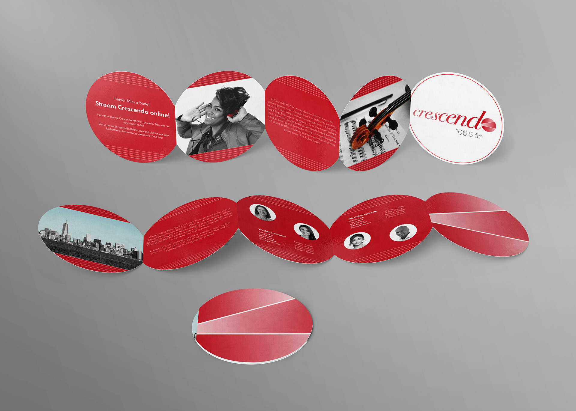
The logo is a modern and abstract representation of a crescendo which reflects the nature of the classical music station and their listeners. Red is the main color because it is an emotionally intense color associated with power, strength, and passion which is a direct representation of classical music. The crescendo mark is abstracted in a circle form. The word and mark contain a gradient, which echoes the meaning of the mark itself, an increase in loudness or intensity.
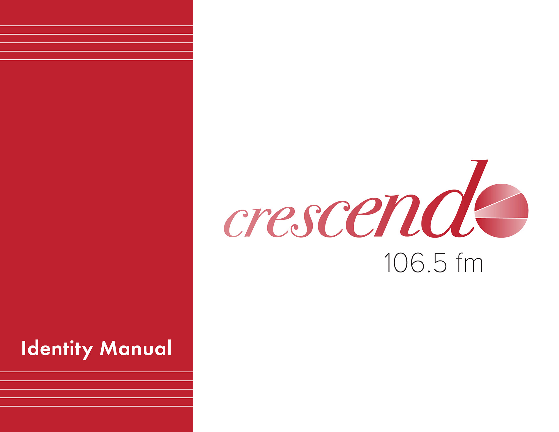
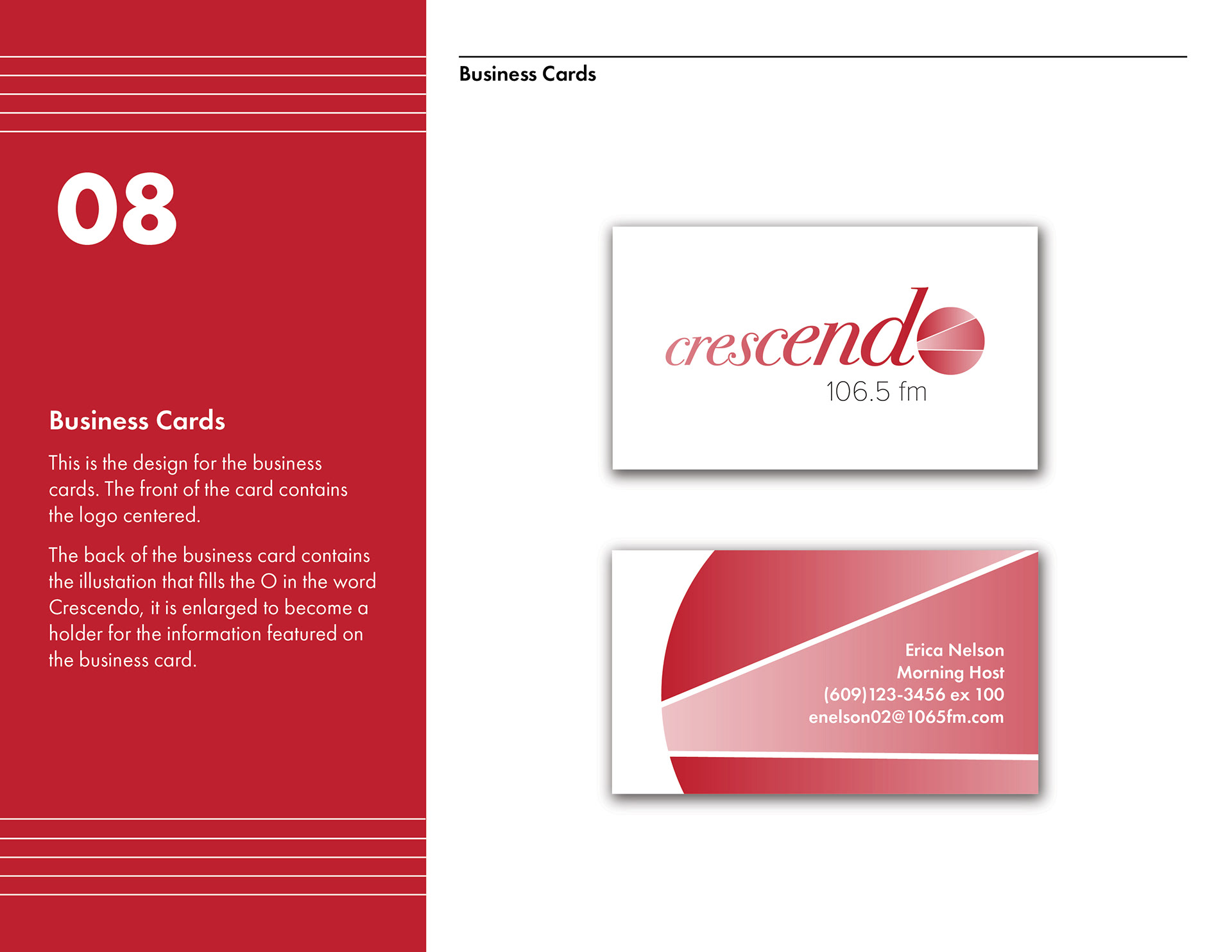
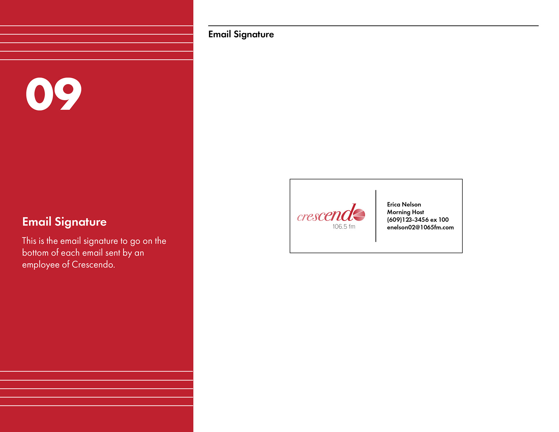
Identity Manual:
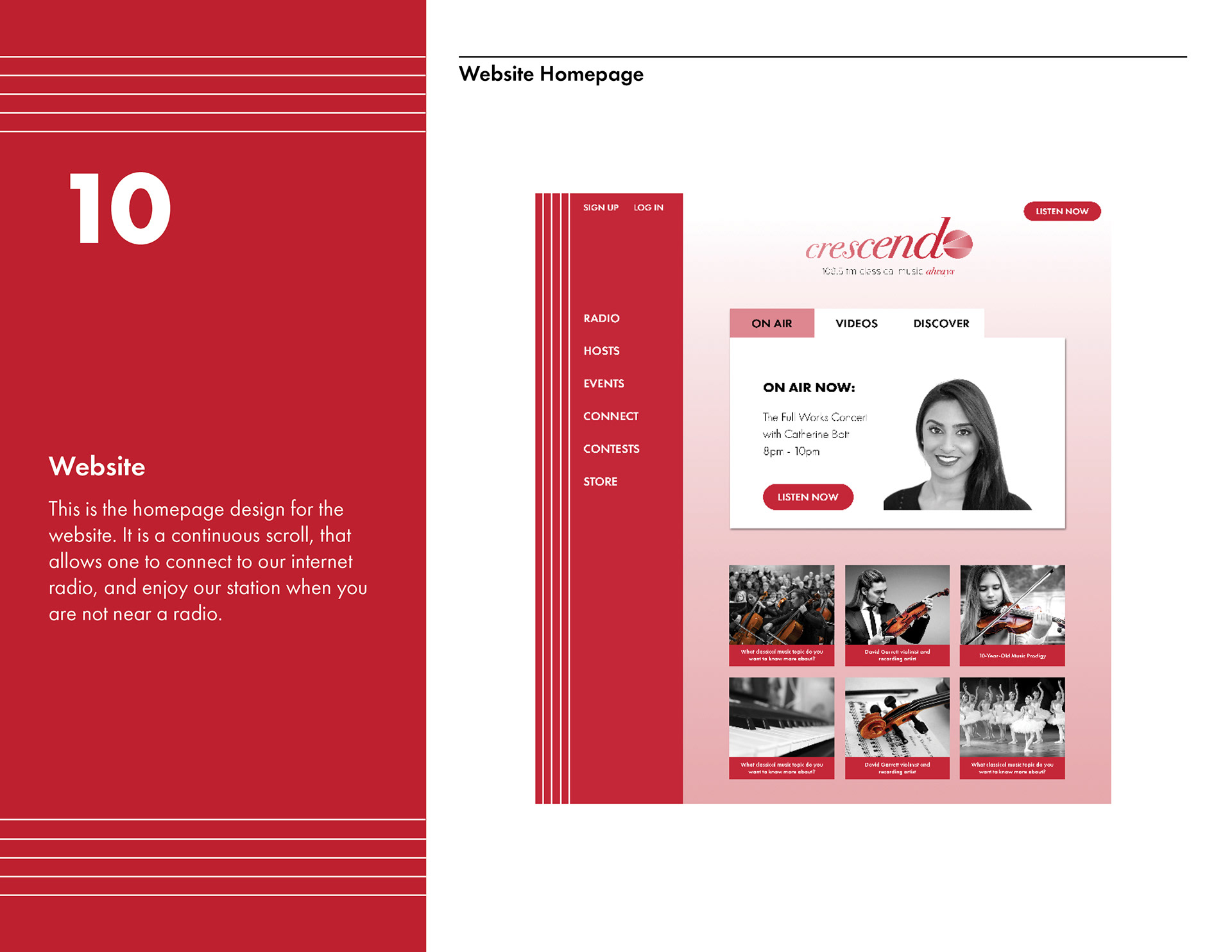
Website:
Brochure Design:
Environmental Design: